Finding The Best Web3 UX Process (Hint: There Isn’t One)
Technologies around the world are causing a transition from Web 2.0 to a trustless and permissionless Web3, causing the global technological environment to change quickly. This has compelled the conventional recognized software businesses to form Web3-specific teams and convert their typical web systems to web3.
But now Web3 is having trouble gaining widespread adoption due to a lack of knowledge and technological complexities. The sole reason for this is the lack of user diversification experience. As the technology itself is complicated, it should at least have a user-friendly interface that gives the user the impression that it has ease of use and a high user diversification experience.
User diversification is a path to a productive and forward-thinking Web3 environment in the future. Mass adoption equals a fulfilling user experience. The more people who utilize these digital environments and tools, the more they resemble the real world. As with the current face of the internet and the web, it might happen as soon as some anticipate.
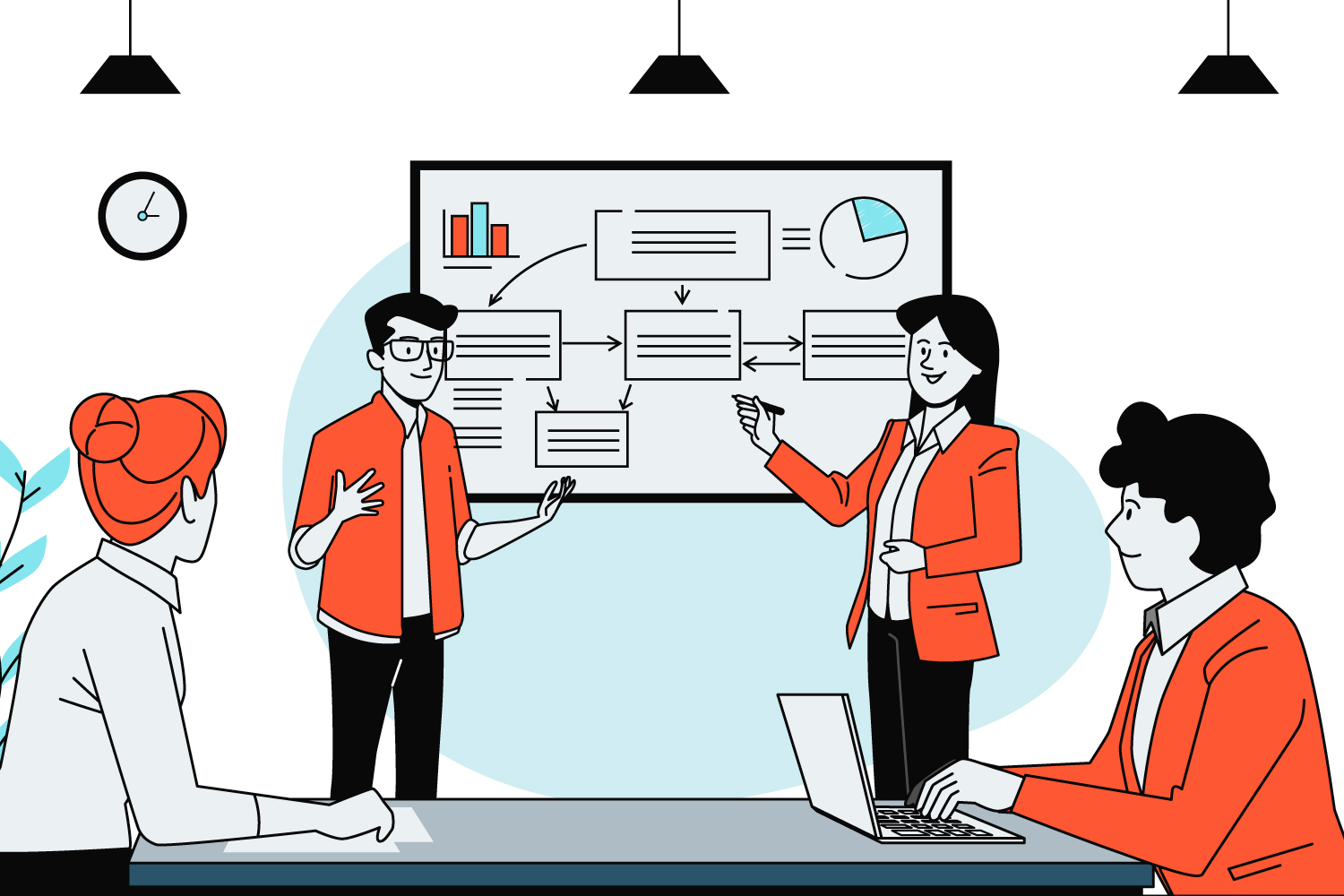
At expedite, being the advocates of web3 design, we have concluded that design is the first and foremost interacting element that enhances the user experience. In this article, we will be discussing the categories of product launches and the processes of UX design that are the best fit for a product launch in the Web3 space.
Types of Product Launches and their design strategies:
1. For Products that just want to jump into the market OR want to onboard investors by showcasing ideas.
These sorts of products are known as Minimum Viable Product (MVP) and can be introduced to commerce after quick steps. The term “minimum viable product,” or “MVP,” refers to a product with just enough features to draw in early adopters and validate a product concept. In the web and software domains, the MVP can assist the product team in gathering customer input as soon as possible so that they can iterate and enhance the product.
The MVP is essential to agile development since the agile process is centered on validating and refining products based on user feedback.
The UX design processes for the first product category are as follows:
- Understanding
The biggest chunk of the initiating design phase is in understanding the project and its requirements. What are the pain points of an end-user? What can be modified in the current product to enhance UX? and how to make the experience of an end user smooth and consistent?
Before creating an MVP or prototype, a UX designer seeks to understand what drives a user and what validation they are looking for. The intersection of UX development and design occurs when the proper products are provided to create a user’s capacity and motivation to accomplish a task.
For understanding, we start by elicitation and requirements gathering.
- Requirements Gathering
Understanding the user’s perspective is essential to mastering the UX design process; however, working with actual users to conduct in-depth user research, which results from the many methods of requirements gathering, is the only way to discover what that perspective is.
By doing this first, we will need to make fewer revisions in the future, saving us a lot of work, time, money, and resources. If we conducted research first and then design, we would need to make significant design adjustments to accommodate the needs of the customers we have spoken with.
This has the advantage of allowing consumers to interact with an existing system directly. Some of the techniques that can be used to collect requirements:
- Stakeholders Meeting
- Interviews
- Focus Groups
- Client Surveys
- Req Gathering Form
- Branding
Product branding is a strategic fusion of design, marketing, and experience that distinguishes one product from others in the same category. It includes every aspect of the product, including the name, graphic design, materials used, delivery method, and physical appearance of the packing.
Product brands have become increasingly sophisticated and specialized for each product. A product’s niche differentiation is the objective.
However, at the core of branding, UX is about knowing the users, establishing the brand’s tone, and then designing helpful products that promote great user experiences. Branding Includes the following elements of a company:
- Logo Design
- Color Palette Finalization
- Mission statement
- Tagline
- Company’s signature font styles
- Design
Formally, there are three main design elements that makeup product design: quality, functionality, ease of use, and appearance.
To build a successful, competitive product, you will need to carefully consider each of these three criteria: an appealing, contemporary design; a useful functionality that helps users deal with their problems, and ease of use can be stated as a user on a website accessing the homepage within 3 seconds of opening the link, and maximum availability, the design must enable high performance and security as well.
To have an improved design process we must consider 3 things.
- Get to know your project purpose well enough. Carefully examine individuals for whom the product is meant to pinpoint the best possible course for future product design.
- Be not afraid of issues. Make it a task for your team to identify and resolve them, instead. You’ll probably need to redo the outcome if you consistently put off solving problems or entirely miss them in favor of focusing just on the tasks you excel at.
- Strategizing your budget in compliance with the design needs is also essential, as it can get both the client and designer in an indecisive spiral where the finances and requirements don’t go side by side.
- The elements in the design to produce or modify are:
- User Flow charts
The user flow guides users through a series of processes from their entry point to a successful conclusion and end action, such as end-users purchasing a product.
- Lo-Fi Wireframing
Low-Fidelity or Lo-Fi wireframing is a basic wireframe that describes the layout of web pages or app displays. They assist you in conveying the “main idea” of your product rather than the specifics.
- Prototypes
A prototype is an early version of a product that has been produced to test functionality. System analysts and users typically utilize a prototype to assess a new design that aims to increase precision. In certain models of the design workflow, the stage between formalizing and evaluating an idea is the creation of a prototype.
- Quick Evaluation
Quick Evaluation is important because it enables teams to determine whether their design is effective for their users. Since testing with high-fidelity designs yields more insightful feedback from end users, the evaluation phase typically begins after the high-fidelity design is complete. The team validates the product with end users and stakeholders through a series of user testing sessions. Evaluation is a crucial phase in the design process where designers would test the prototype.
2. For products that require quick UI with detailed research on UX:
When the clients ask for enhancement of the user experiences based on real user data having thorough research of user experience to launch any product, in this type of product launch the focus is on the detailed research of UX for the product with a short launch window having a simple quick UI. This sort of product is studied and data is gathered using user feedback, reviews, surveys, and the normal initial procedures discussed above. Understanding, Branding, Design, Quick Evaluation, and designer’s testing prototype.
The client can now onboard investors using this prototype OR enter the market. Meanwhile, the UX designers would begin gathering data in preparation for the launch of the next edition, which would have a better UX and be more user-centered. The continued procedures would include:
- In-Depth Evaluation
In the deep evaluation method, the team runs usability testing, qualitative testing with moderated usability testing, and quantitative via data gathering through product usability interviews, social survey forms, product communities, testing groups from actual users etc. For testing a running piece of design there are multiple ways to achieve that. One is the Qualitative + Quantitative usability testing through Maze
- Research
If you are wondering about the research after launch then yes! We strongly abide by the rule of iteration. Iteration is the key to a brilliant UX enhancement.
The product launch research process can be broken down into seven general steps: understanding the market and the competition, focusing on the customer, developing a distinctive value proposition, choosing a marketing strategy, testing the product and general strategy, launching the campaign, and monitoring the overall lifecycle. These steps include Competitive Analysis, User Interviews/Personas, focused groups, Affinity Mapping, Journey Mapping, Information Architecture (Optional), and User Flows.
- Design Refinements & Final Evaluation
Design refinement can be defined as the process of changing a concept to make it more useful/easy to use or aesthetically beautiful. Renovating a certain design element, such as a web page’s layout, to make it easier to view.
In design refinements, the design system, UI, and prototype are modified if requested by the client. In this final testing, the product’s usability is examined. Both comply with Qualitative and Quantitative separately and at once.
This final evaluation helps to provide proof to the client about any change history, also maintains a log, and that the product is tested and verified, etc.
3. For Products that have enough time to follow UX Processes and want to get into the market with a User-Centric Product.
The final product category in which the time is fully invested to follow the thorough UX processes on to the product, making it a user-centric product. These products are called user-centric because they follow User Centric Design (UCD) in which the user is the heart and soul of the product. The needs, goals, and feedback of the consumer when creating digital products are the top priority.
This type of process follows the same initial procedure in understanding the business, gathering the requirements via surveys and forms then branding the product having a signature theme and consistent design. The design and Evaluation follow the same procedures as above. However, In the research phase, a few new options are involved.
- Understanding
- Requirements Gathering
- Stakeholders Meeting
- Req Gathering Form
- Branding
- Logo Design
- Brand Guide
- Research
- Competitive Analysis
- User Interviews/Personas
- Focused Groups (Optional)
- Affinity Mapping (Optional)
- Journey Mapping (Optional)
- Information Architecture (Optional)
- User Flow
- Design
- Lo-Fi Wireframing
- Design System
- UI Design
- Prototype
- Evaluation
A heuristic evaluation can be used to determine how user-friendly a website is. In other words, it evaluates how usable the website is. In a heuristic evaluation, unlike user testing, where users assess the website (or prototype), the site is evaluated by usability specialists.
To conduct a heuristic evaluation, the experts perform Usability testing inclusive of
- Usability testing
- Qualitative
- Moderated Usability testing
- Qualitative
- Quantitative
- Data Gathering through Survey Forms
- Qualitative + Quantitative
- Usability testing through Maze
- Design Refinements
Summary:
User diversification experience is the common lacking point of most Web3 products. It is not an impossible approach to reach every category of the user, but the design can be made smooth, consistent, and attractive enough to get a massive percentage to adopt this young technology. The UX is said to be the heart and soul of any product-based business.
It has a 400% conversion rate of potential to convert one-time clients to your daily users. Brands need to focus on the User Experience as much as or rationally speaking more than other areas. The above processes are curated to help Web3 design companies follow a guide and produce compelling products with a high conversion rate and user concentration respective to their type of category of product.
Expedite Live Design Supported Products
We take pride in successfully completing and deploying satisfied clients’ products. The experiences that we gained in the design processes are all part of our learning to make the processes more user-friendly in the future. You can check Unipilot and Metadot to see live results. Check out our work for more inspiration.