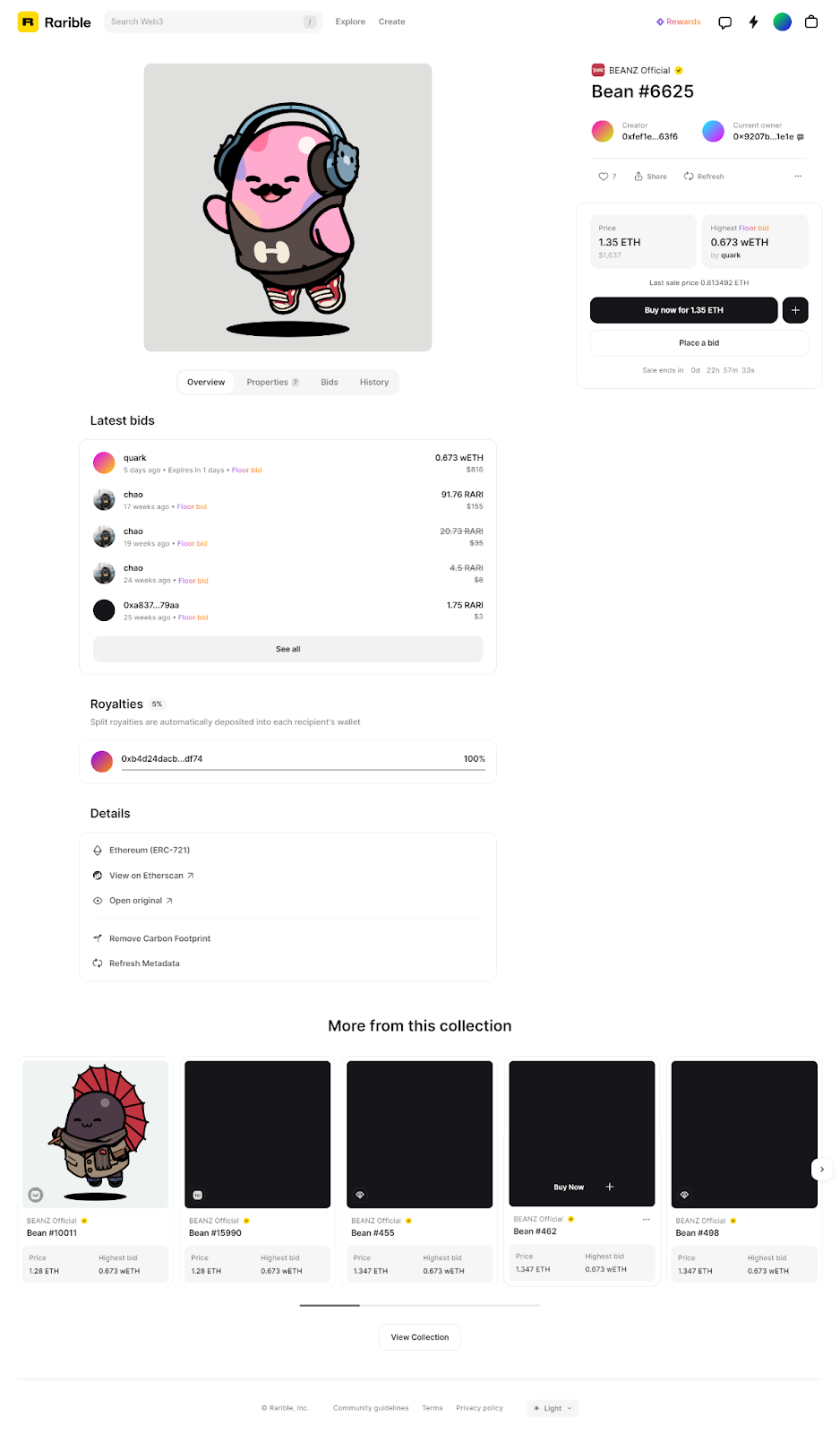
Solving 7 Major DeFi Pain Points With Web3 UX-2023
Decentralized Finances (DeFi) have been gaining mass reach since 2018 but it is still not ready for them. For mass adoption, how easy should the application’s User Experience be? “Well, it should be smooth enough so my grandma can use it.” -Izzul Syazwan, a Web3 UX advocate.
DeFi, which exists as a promising alternative to traditional finance, faces seven key challenges that hinder its widespread adoption:
- No Guided Tutorials
- Money laundering and Safety Measures
- Tutoring on Gas Fee and Implications
- Wallet Delays
- Error Messages with no clarity
- Missing Stability Visualization
- Knots of Networks
No Guided Tutorials
“We fear what we do not understand”
Jargon like DAPPs, DEX, gas fee, slippage, etc. is too technical for non-tech savvy people to begin with. And seeing crypto platforms that are graph-heavy with blue UI–straight out of futuristic movies–can feel ‘alien’ to older generations.
Letting the user blindly walk around the complicated platform, figuring things out on their own or getting tangled in jargon is daunting.
UX Solution:
Walkthroughs or guided tutorials for first-time or returning users help them understand the flow, following updates or complicated steps to perform rather easily.
TransferTo includes some video tutorials on hover. In the clip above, you can see a video explaining how to disconnect your wallet. One step beyond a standard tooltip.
Another engaging strategy implemented by StarGate is to let the users switch to walkthrough mode and to guide them on the time it takes for the token to exchange by providing a cool animation.
Money laundering and Safety Measures
With everyone allowed to participate in DeFi, it is very easy for criminals and terrorists to launder money and finance their terrorism and criminal operations. It should be controlled and under surveillance. However, some UX operations to tackle the Money Laundering:
UX Solution 1: Decentralized Identity and KYC/AML Integration
Implement decentralized identity solutions and streamlined KYC/AML processes to ensure user accountability and compliance with regulations, while maintaining user privacy.
UX Solution 2: Enhanced Transaction Transparency
Develop user-friendly tools that enable users to easily trace transactions, addresses, and interactions, enhancing visibility and enabling quick identification of suspicious activities.
UX Solution 3: Collaborative Governance
Establish decentralized governance models involving stakeholders and regulatory bodies to collectively set rules and standards, alongside real-time reporting features for users to flag potentially illicit transactions.
Check out our detailed UX Audit for Metamask
Educating On Gas Fee & Implications
Swapping tokens and getting declines due to not having enough fees to complete other transactions can be a frustrating situation.
UX Solution:
To make your swapping experience smoother, educate the users on how much gas fee will be consumed additionally how much is left/ if it is enough for another transaction or not.
Balancer offers a helpful feature. When you swap some of the native tokens, like Ethereum, Balancer calculates how much will remain in your wallet after the swap. It also checks if the remaining amount will be sufficient to cover the required gas fees for future transactions. This information is presented to you through a simple progress bar and message displayed in traffic light colors.
By providing this user-friendly interface, Balancer ensures that you are aware of the implications of your token swap. You can easily see whether you will have enough tokens and gas fees to continue your transactions after the swap. This way, you can avoid any frustrating situations of being left with insufficient funds.
Wallet Delays
The challenge of wallet delays in updating balances within the Web3 ecosystem poses a significant hurdle to mass adoption. While early adopters might tolerate such inconveniences, mainstream users expect seamless experiences. Current excuses like “building the future of finance” no longer suffice. Decentralized wallets, connected to various protocols, struggle with delayed balance updates due to technical complexities, fostering fear and uncertainty among users.
UX solution:
Enhancing network performance, improving user interface communication by providing timely notifications about slowdowns, and exploring decentralized notification systems like EPNS, which could bridge the gap between users and their wallets, fostering confidence and trust in the ecosystem.
Error Messages with clarity
DeFi platforms often fail to provide clear and informative error messages during transactions or interactions with smart contracts. Bar notifications or relying on external tools can leave users confused when errors occur, as these messages are fleeting and lack prominence. Users are left uncertain about what went wrong, hampering their overall experience.
UX Solution:
Implement modal pop-ups for errors. These attention-grabbing modals not only highlight errors but also offer user-friendly instructions for resolution, enhancing clarity and transparency.
DeFi platforms can adopt Spookyswap’s approach by using modal pop-ups for every state, including errors. This approach ensures users are well-informed and reduces frustration, fostering trust and confidence in DeFi platforms.
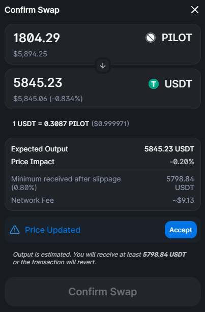
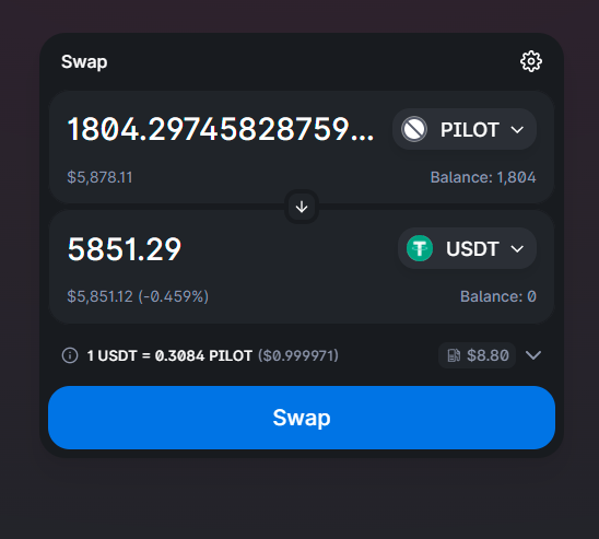
Provide Stability Visualization
In DeFi platforms, demonstrating stability in each currency poses a crucial challenge. When swapping tokens on a DEX, transactions typically involve multiple swaps, and some DEXes show this route, which can be especially valuable when dealing with stablecoins as choosing one stablecoin over another might yield a better result. However, in a rapidly changing token price environment, users might end up with a different amount of their desired output token than expected. This can cause confusion in the total amount spent versus the expected.
UX Solution:
Displaying the swap route and quantifying the volatility of that route, offering users valuable insights into potential price fluctuations.
Velodrome incorporates a separate price information section, ensuring that the USDC price for any tokens is prominently visible. This design approach, with its generous use of white space, provides with the clarity and prominence it deserves, enhancing the overall user experience.
Knots of Networks
A DeFi that has embedded many networks from currencies can become overwhelming for the users to keep track of. Sometimes it can also create confusion with similar names and logos.
UX Solution:
To include description notes for each network helps to educate any kind of user for that network particularly.
Idle Finance is doing a good UX job mentioning a bits of all the networks it has included.
Why is is so important that users get best experience and know the technologies they are interacting with? Simply put, “Communicate value to users, not just technical terms”.
Now, more than ever, an increasing number of crypto and DeFi firms are dedicating significant resources to UI/UX enhancements, recognizing their pivotal role in achieving widespread adoption.
Got your Web3 App or Platform? Get our FREE UX Audit (Limited Time Offer)


