Web3 Design Principles

What is Web3

Everyone seems to be talking about Web3, how it will transform the current apps we use, manage our data, and handle our accounts, how Web3 Design looks and is created and what makes it different from Web2? 

To begin with, Web3 is all about the decentralization of the Internet. For easier understanding, the following features would be the best way, to sum up, the new Web3.0 era:

What does Web3 Design mean? 

In terms of the acceptance and use of web3, design is an important element. Since the majority of the users interacting with the terms of Web3 are exposed to DApps. To help them overcome the complexities of new technology, design is used as a primer in between.

Depending on the Web3 applications type, design rules will differ slightly depending on the type of dApp from standard web 2.0 apps to Web3.0 apps and all it contains (Gaming, NFTs and DEXes, etc.). However, there are some general design concepts that a designer should be educated about. 

The three main pillars of Web3 UX

Pillar 1: Educating on technology

Help the user understand any step he is going to work on and make it simpler for them to navigate the function by adding minor user interactions, tooltips, straightforward animations, pop-ups, or familiar, clearer terminology.

Web3’s status makes one thing quite clear: individuals won’t typically have the mental models and ways of thinking that it will require (yet).

It is the responsibility of designers to assist users in navigating the blockchain learning curve as they become more aware of the technology and its potential.

There are certain resources that can help anyone learn about the jargon, processes, mindset shift, etc. 

The need of defining the terminologies will be not much necessary once when blockchain becomes more common. However, businesses are correctly focusing their efforts in this area for the time being.

Specifically, the designer’s goal of assisting the common person is comprehending blockchain.

Example: Binance Academy has listed all the crypto jargon as a glossary with one-liner definitions. 

Pillar 2: Transparency

Users should have access to all relevant transactional information, especially for De-Fi apps that support a large number of transactions. As for design, this comprises:

Transparency example

Pillar 3: Familiarity

As Jacob’s law of UX design states, 

“The majority of user time is spent on other websites. This indicates that visitors desire your website to operate similarly to every other website they are already familiar with.”

Specifically, a Web3 application should be similar to a Web2 one in terms of user experience. Following this, you make it easier for people who are still learning about topics like cryptocurrency wallets, blockchain technology, etc. to utilize them.

Example: 

The user should not find the connection of the crypto wallet procedure any different than using his/her conventional online banking procedures. Whatever they are transacting should be as easy and as similar to their daily banking experiences. 

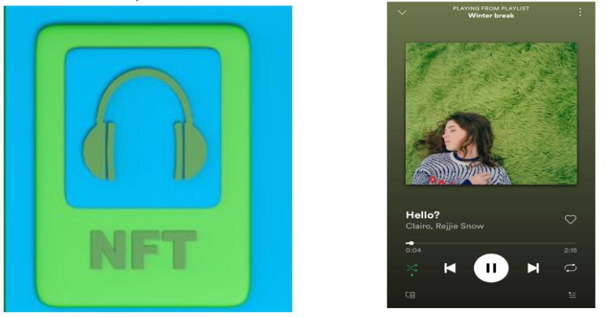
Secondly, minting their audio NFTs should be as smooth and familiar as their normal Spotify uploads, or YouTube video uploading process so that they do not find it an additional complexity as cost of ownership.

Web3 UX principles

When creating web3 user experiences and interfaces, designers should consider the best practices in the Web3 Design Principles collection. 

Active Guidance

Definition:

Users must have easy access to steady navigation that makes it clear how to return to a previous state and what to do next.

Principles:

Consider where your personas are most likely to turn for assistance while anticipating the need for additional assistance and working to reduce it.

One must take into account various perspectives of an interface because visibility management is crucial for business.

Avoid adding components that will clutter an interface or mislead users. Every component has a function.

Utilize standard design patterns to minimize user learning requirements.

Examples:

  1. Dodo is a decentralized exchange. On the exchange right now, there are 8 coins and 14 trading pairs. 
  2. When the users visit the website. Dodo provides a visible and simple use case for anyone willing to liquidate. 

It reflects the text in real-time currency exchange value right opposite to it. The play cards can be navigated back and forth to find all the currency values in real time that the platform supports.

  1. Moving along the sentences highlights the words and explains to the user about the platform’s service definition of it.

B. DTube is a decentralized (Web3-based) video streaming platform. At first glance, a user will find it similar to any other web2 video streaming service. Like YouTube, Vimeo, Dailymotion, etc. 

The approach behind DTube is the design consistency of what the viewers’ UX is trusted to till now. 

Consistency

Definition:

The establishment of uniformity across products and the customer’s experience is important for building trust.

Principles:

Use the same “Blockchain color” consistently throughout your project and be consistent with your font selections.

Keep your color choices and associations uniform and similar by maintaining consistency.

Grid-based designs with proportional and meaningful negative space should be kept in the design.

Wherever our users are, we design for them.

Examples:

Rarible, a popular NFT marketplace, states a good expression of consistency in the design such as the ground alignment, typography choices, and spacing. The strong-grid layout throughout the web page is quite impactful.

Community

Definition:

The services of Decentralized Applications may be only used by individuals but the basis of development of any application is planned for and also used frequently by, a sizable group of people worldwide. Community formation of a single type of user is beneficial for making the user experience better with uniform holistic feedback. 

Principles:

Indicate the number of community members worldwide independent of any region.

Categorizing the community with the law of proximity. 

Describe the community’s composition in detail (that is sub-groups and their power over the project)

Describe the project’s larger purpose (if any) and how their participation helps it to be fulfilled.

Examples:

Parsiq Network gives quick access to web3 data, enabling particular features in your applications. The platform has been designed specifically for developers who want to build event-driven apps with a focus on trending reactions to events. It has a supportive community system integrated into the site.

Data Transparency: Provenance

Definition:

A user must be able to determine whether a certain piece of information or piece of data is actually saved in the Blockchain, maybe just by looking at the page. 

Principles:

Make it clear which information originates from the Blockchain and which does not.

Make the contract’s address clear (s)

Connect all Blockchain information to unbiased Blockchain explorers.

State what data is derived from oracles

Examples:

When Data Provenance option is turned on. It highlights the blockchain data in Green color for better visibility. The value is also made prominent. 

Data Transparency: Transactions

Definition:

Allowing users to make assumptions and assume that “all” data visible is saved in the Blockchain is not user-friendly. The design should communicate enough at just a glance. 

Principles:

Clarify actions that are irreversible.

Clarify actions that involve money or value.

Clarify actions that could potentially lead to user identification.

Clarify actions that generate new contracts in users.

Examples:

In the SuperRare NFT market when placing a bid, this screen is captured. The message informs you of the value and permanency of your activities.

Don’t Forget the Newbies

Definition:

If we want Distributed Applications to be widely used, we must remove the entrance barriers for those who lack technical expertise or familiarity with the Blockchain and its jargon. The user would also benefit from being aware of the key distinctions between Decentralized applications and other applications. 

Principles:

Apps should try to minimize the use of new words and concepts, especially on the pages for the generic public (ie. homepage), and progressively show more learnings on pages for engaged users (ie. User dashboards).

Make every effort to use jargon-less, consistent terminology. Language should be concise, clear, and align with our users’ natural communication patterns.

Provide 2 or more levels of educational content: Blockchain Basics and Decentralized Application-specific terminology.

Try to weave in the snippets within the interface, with temporary pop-ups that can be easily dismissed that then could open more detailed information in another tab.

Examples:

OpenSea has a learning service available for newbies entering the NFT market. Gives a complete service to the user from learning from scratch, building NFTs, selling, and purchasing. 

Feedback 

Definition:

Through the design of constant feedback, we assist our users in understanding what is happening and lower anxiety. 

Principles:

When used sparingly, motion and animation support the understanding of what ia happening.

The user should always know what is happening, what just happened, and what will happen next as time is a significant element in Blockchain.

Examples: 

Upon connecting the wallet or refreshing funds OpenSea provides prompt feedback to let the user inform about his confirmation of activities. 

Trust

Definition:

Maintaining the trust of our users, many of whom work in fields involving highly sensitive data, is essential to the success of our company. The blockchain is “new” to almost everyone, with varying degrees of knowledge and assurance. Users must believe that our goods (and the people who created them) are stable, dependable, and trustworthy.

Principles:

Final word

Dapps are fundamentally distinct from regular web or mobile apps because they are built on the powerful Blockchain-enabled principles of decentralization, transparency, trustlessness, immutability, not hidden etc. and should strongly convey these values.

These Design Principles translate the characteristics of the Blockchain into useful tools by reflecting them in the front-end of Dapps for a promising and smooth User Experience. 

Check out The Best Web3 UX Process in the world of Web 3.0.

Metaverse Design: All you need to know

Remember when our parents complained about how we lived on the internet 24/7? Well, we will be proving them right soon enough! 🤣 How? Thanks to the Metaverse Technology. At this point, you must be questioning, what is a metaverse.

The metaverse is a virtual replica of our real-life world. First, let’s see how the creators of the metaverse explain it.

Mark Zuckerberg on Meta

“Today, I think we look at the internet, but I think in the future you’re going to be in the experiences” -Mark Zuckerberg

“With the Metaverse, we are transitioning from viewing a 2D world looking at the internet to living inside in a 3D world ” -Dave Water

“The Metaverse has become the newest macro-goal for many of the world’s tech giants.” -Matthew Ball 

Mathew Ball on Meta

Other than the Meta-makers, this is what the internet-people who are curious yet do not know much, have to say:

Metaverse design meme

And trust us, we are enjoying the creativity 😜

Metaverse design meme

So, is it actually all pile of nothing? Yes and No. 

Yes, because it exists virtually, and No because it is not about investing and dealing with imaginary stuff. Here is a proper explanation of the Metaverse:

What is the Metaverse?

The entire metaverse network is a decentralized platform meaning: shared by everyone, which may be continuous and in real-time, which is present in the post-internet era. The metaverse is not something you can physically own. 

It is an open 3D virtual world where everyone can take part. There are various metaverses made by various individuals or groups.

Something people often mistake the Meta for the entire Metaverse is the owner Mark Zuckerberg. The founder, chairman, and CEO of Meta, Mark Zuckerberg, has shared his vision of the Metaverse’s future as well.

For investing, unlike The Mask movie, 🎭 you do not become a billionaire overnight. But investing in the metaverse is also not something imaginary as most people have perceived about.

Investing in the Metaverse entails buying stock in well-known companies, buying non-fungible tokens (NFTs), creating one’s own non-fungible tokens, and buying or renting real estate on virtual platforms. There are numerous choices, and they are all promising.

If the metaverse is widely used, there could be high profits. Investors have institutional backing, indicating a firm position in the market.

How to get into the Metaverse Design

To master some skills, we recommend experiencing them. That’s right, to be a metaverse designer you must fully experience it. Have a virtual tour of it, meet new people, buy real estate in the metaverse, get metaverse equipment, and so on.

This will not only give you a fun adventure in a new world but will also provide first-hand experience of what is up-to-date, which UX components are already available, what else can be done to enhance the usability of the system etc. 

We have curated a list of important features to guide you to become a Metaverse Designer and explore the possibilities of Metaverse as a UX designer. 

Design is everything

Metaverse design meme

Mandalorian is absolutely right. Metaverse is nothing without design. Metaverse requires compelling storytelling, Augmented Reality (AR), Virtual Reality (VR), 3D animation, etc. Here designers play the most crucial role in getting the metaverse integration’s design component just right. After all, Design has to be something that makes it feel like users’ real-world space. The three core spaces where designers need to focus are:

The successful design would be to provide a truly immersive experience, aiming to “bring things to life” in the metaverse and make them seem tangible and as life-like as possible.

Mindset for the great metaverse UX

The metaverse designer needs to reform their mindset for the technology so that the user interacting with it is not just a mere user, but a player. To do this, UX designers will need to broaden their perspectives on skills and disciplines. Because these virtual worlds are comparable to societies with entirely different systems of ethics, economics, sociology, and psychology are all involved.

A critical component of effective design is accessibility. Since many other design elements, such as the motion sickness in VR, can negatively affect users, creating an accessible metaverse experience is definitely a challenge.

The early stages of metaverse design offer a great opportunity to incorporate accessible technologies right away rather than later trying to improve systems to be more inclusive. Designers will probably need to come up with brand-new, easy methods to encourage people to spend a lot of time in virtual environments.

It is not bad being a noob, noobs act as the bridge to create smoothness between the initial trial and mass adoption of any technology. 

In fact, it means creating such User Interfaces that are represented as walk-throughs and have the tendency to communicate with new users. It allows more opportunities to learn, explore, and interact with new technology. The metaverse itself is supposed to be the new, more interactive internet.

In the metaverse, data protection, security, and privacy should be included from the beginning as the top priority. It’s crucial to create environments that discourage cyberbullying. Users should be allowed to choose whether they want to be alone or with the firm, and individuals who negatively affected them should be removed from their connection. To design more safe and more user-friendly services, product designers will need to collaborate closely with data security experts and behavioral psychologists.

As the designers have to keep the critical factor of making learnability, findability and usability a priority they must also concentrate on the importance raised by the development side of these virtual universes. 

As a result, it will allow the players to not have to face any technical barriers throughout their interactions. Learnability and ease of understanding will assist the players to spend a good, satisfactory time in the virtual world. 

What is the required expertise?

Here comes the good part! Below is the concrete skills info that the designers need to pull in order to become the metaverse UX designer. 

Holograms sound cool, right? It is exactly the kind of technology that the matrix movie introduced to us to fantasize about the magical virtual world. 👩‍💻 Metaverse designers highly utilize extended reality in the virtual world to create smooth user experiences.

Designers use Extended reality which is a fusion of AR (Augmented Reality), VR(Virtual Reality), and MR (Mixed Reality). This Extended Reality helps the players to experience a life-like world in a virtual environment.  

Recognizing the user’s physical environment, User Perspective and depth are three important aspects of the physical world. In order to create experiences that keep users safe while they are in the virtual world, designers will be able to map the environment surrounding the user using sensors in VR headsets.

We are aware that non-verbal communication makes up a significant component of human connection. Face expressions can be used to convey emotions. As you connect with others, Avatar will be able to depict current human emotions. Standardization of head, hand, and body movements for gestures in virtual reality.

Standardization will enable the usage of traditional patterns, making it easier for people to learn how to use products created for the metaverse.

The next stage in the growth of the animation sector is a virtual world. Immersive virtual worlds can be made possible using NFT, or metaverse technology. As this technology gains in acceptance, interesting new prospects are emerging for all kinds of animation. 

The avatar can move, communicate, and carry out specific actions automatically for each player. These avatars are becoming more prevalent in online gaming communities like Second Life and Roblox. These are created using traditional as well as contemporary 3D animation.

Methods & Tools: 

Many designers are curious about the tools they can use to create a metaverse experience because the metaverse is still more like an early technology. We have summarized the majorly used tool for building genuinely immersive experiences in this section. 

Metaverse Engines

You may design virtual places where players can engage with each other using platforms and engines.

Tools for 3D modeling

Using 3D objects, the Metaverse’s virtual world will emerge as a real world. The ability to create 3D models will be a challenging one for metaverse creators.

Challenges in Metaverse Design:

1. Creating the UI

What is the primary interface distinction between the world as we perceive it and the Metaverse? In the actual world, the user can see and touch the interface since it is in front of them. In Metaverse the user is inside the interface in a virtual environment.

The fact that a static design is no longer essential but rather an addition to a more immersive design poses a dilemma. The task of creating environments and experiences in a virtual world then falls to someone with extensive architectural knowledge.

2. Heads-up display (HUD)

The panel that projects information onto the windscreen into the driver’s or pilot’s line of sight is known as a heads-up display. When it comes to gaming and user interface, the status bar is where information is displayed to the player or user.

A packed HUD seems only natural playing an important role in promoting the Metaverse. Consider it; it’s a brand-new world that only exists in your sight, and you’ll require assistance navigating it. You will need HUDs in the virtual world since they provide info panels, minimaps, inventories, colour filters, accessibility filters, and other features. Concise the info is then UX’s job.

3. Virtual Reality Sickness

Speaking of VR sets, while they may be your definitive route to travel and explore the Metaverses, they are also causing worry because they are uncomfortable. Cybersickness is a condition brought on by VR headsets that imitate the effects of motion sickness.

In essence, you are deceiving your brain into thinking something is moving when it isn’t. It is this separation that makes people sick of virtual reality.

4. Dislocation

It’s possible that this young technology may reach us in many years. However, users do not go from one static page to another in the virtual world rapidly by clicking or tapping, which is the basic foundation of contemporary UI and UX design. Instead, even in non-tangible spaces, users move from one spatial entity to another

The virtual space might be rather confusing for the user if there is no sense of continuity from one stage to the next. The connectivity of all the spaces inside the metaverse is a critical factor for the designers to keep in mind.

What is it like painting the infinite canvas?

Know what the video game players 🎮 first notice and enjoy the most? It is definitely the game plot and the design. The people who build the connection between users of technology and those who create its interfaces are mostly UX and UI designers. They “interpret” it for the players, removing obstacles and facilitating communication with devices and apps.

People can work, play, shop, interact and engage in other activities in the “metaverse,” which is a graphically rich virtual area with some resemblance to the real world (or, perhaps, more importantly, the internet).

To create experiences that become the gateway into other universes, UX designers will need to adapt their perspectives, skills, and processes. To do this, they must first stop considering those who use technology as “users.”

They should think of them as “players,” or individuals who exist, inhabit, and live in this virtual environment.

UX designers must develop an immersive design in order to give “players” excellent experiences. One that enables users to live in virtual environments not just visit them. To not achieve sustainable yet simple goals, designers are to be fully committed.

Common mistakes of a UX Designer

Before we explore the common mistakes that a UX designer makes, it’s important to first understand the role of a UX Designer. UX designers focus on making the experience of interaction between humans and digital products better.
In this article, we are going to highlight some of the common mistakes that a designer makes. After all, designers are human beings so they are bound to make mistakes, no?

1. Inconsistent Design

UX Designers, especially beginners make this mistake of inconsistent design. It can be in terms of color palettes, icons, fonts,  buttons, paragraphs, links, headers, footers, hover states, and much more. The inconsistency in design can put your users in doubt about the credibility of the product. And most importantly it will compromise the aesthetics of UI.

2. Ignoring the responsiveness of design

Responsiveness is the key element in a UI/UX Design. Responsive design can help you solve a lot of problems for your website. It will make your site mobile-friendly. It will eventually help in increasing the amount of time that visitors spend on your site. Despite this much importance, unfortunately, most of the designers including me don’t focus on it and it becomes a major obstacle in development.

Recently I made a mistake of responsiveness, here is a glimpse of it:

The above screen is designed by me while the below screen is designed by the developers .

3. Bad UX writing

The language used when creating a digital product is of high importance. The way we speak to the user defines the way the user behaves toward our product. The level of communication must be understandable and human-friendly enough to create a bond. The element of good UX writing is missing in many designers’ work although it creates a major difference in overall “User Experience”. We can observe it from the following example.

4. No proper research

UX Designers normally consider themselves and stakeholders as the real users. But that’s not the case, they are not representative of your target audience. Involve the real users in the design process, rather than having internal colleagues be participants, as they tend to be too close to the design to provide honest and accurate data.

User experience cannot exist without users. User research is a tool that can help you achieve your goals. As UX designers we should remember one thing that UX means “USER EXPERIENCE” so we must consider the real user in the research phase otherwise it will somehow affect the UX of the product. 

5. Usage of dummy content

Trending tools like (Adobe XD, Figma) have plugins for dummy text so we normally use  “Lorem Ipsum”.  If we talk about the dummy content, it works well for the best-case scenarios but doesn’t fit in the worst-case scenarios. If the design is finalized with the dummy content, it will cause alignment and spacing issues with the actual content. As you can see in the example: 

6. Lack of collaboration with the developer

Designers often struggle in collaborating with developers. They just hand off the mockup to the developer to develop it and at that time it is discovered that the development of our mockup is not possible so it becomes a barrier for the product. The actual product that will be used by people will be developed by the developers, so it’s essential for the developer to understand the designs completely. As designers, it’s our responsibility to keep the developers in the loop with us. So now we can conclude “As a UX Designer, we have to design user experience for the real user and for the Developers too  “

7. Poor naming convention

Naming conventions are important for teamwork. It standardizes the way of working within a department, decreasing the dependency on the individual person. The mistake that most designers do is that they name the artboards, components, and other things randomly, so it can become a problem for the developer or any other designer. Some may say that using a Naming Convention is outdated or time-consuming, others may not consider it attention-worthy. But, the truth is that giving proper naming to your artboards can save you and the developer from a lot of hassle. 

      “Work as if you’ll die tomorrow and leave no room for misinterpretation in your deliverables”

You can see the above example of Figma Hand Off, this will create problems for developers if they want to download any asset because there is no proper name of any group and icons.

Let’s sum it up

There are many other UX mistakes we tend to do that can ruin all our efforts. But these are the major mistakes we normally do in our designs. UX Designers should use the best approaches or principles and not be afraid to innovate but to ensure great usability, designers should test their design thoroughly with real-world users. Designers must keep in mind that if the user suffers from design, the UX will be considered poor, and eventually people will switch to another platform.